Micron has a new corporate logo. Gone is the orbit around the M and in are the new curves. Since we use a ton of Micron RDIMMs as well as some of their SSDs, this is a notable branding change. Of course, we love to hear what you think about it.
Micron Has a New Logo
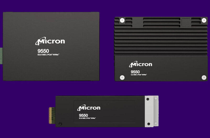
Here is a good look at the old logo on the Micron 9550 SSDs where we can see the orbit around the M.

Here is the new logo that we received from Micron.

With any branding change, we always get some mission statement or design philosophy. Here is what Micron sent STH:
Inspired by the curves and colors of its silicon wafers, the new logo design embodies what is at the core of Micron’s technology leadership: staying ahead of the curve – anticipating future needs and driving the next generation of technology. Innovation and rapid execution are central to Micron’s vision of transforming how the world uses information to enrich life for all. (Source: Micron e-mail to STH)
Micron is behind the initial curve on the M, but ahead of the trailing curve on the right. Maybe it should be that Micron wants to sit in the sweet spot of the technology curve.
Final Words
Branding notes aside, what do folks think of the new logo? It is certainly less drastic than the 3rd generation Intel Logo re-design, which also included sweeping product name changes. Micron seems to have gone with more of just a logo change. Personally, I am neutral on the change. Still, a lot of us see this logo all the time, so if you feel strongly one way or another, that is what the comments section is for.

